Independent 3-week sprint to design a mobile app modernizing energy and electric bill payments.
Problem statement
Utility customers need a simpler and more accommodating way to pay their bills, because 42% do not pay on time, which can snowball into late fees, higher interest rates, or loss of assets.
Personas
1. Erin is a tech savvy, 26 year old marketing specialist. She is always on her phone, multitasking between social and work responsibilities. She lives with a roommate, with whom she splits the cost of utilities. Having dealt with fraud in the past, she does not ever like to use autopay, and gets anxious about the security of her payments, especially if it’s a third party vendor. And she values productivity and efficiency — so she wants the payment to be quick, as well as settling the bill with her roommate.

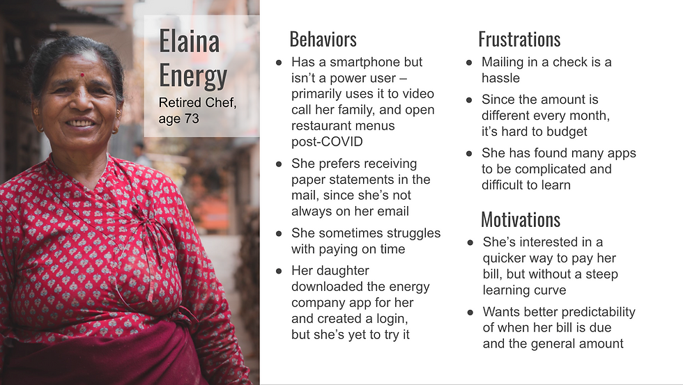
2. Elaina is not a smartphone power user, but she does have one. She used to be a chef, so she enjoys supporting some local spots and can use the QR code scanner. However, she’s rarely on email. She receives paper statements, and occasionally she’s late on getting her check in the mail. It’s also a pain point for her that the amount is different every month. She wants the payment process to be quicker, but is apprehensive about learning a new app or paying online. Her daughter downloaded the app and made a login for her, but she’s yet to use it until now.
Journey maps of the proposed state
We have 3 stages — awareness, decision-making, and payment. I’ve divided the journey map into the steps, feelings, thoughts, and then business ops to keep everyone aware of what it will take in the background, as well as set some product requirements and define responsible parties. A main difference between Erin and Elaina's journey is the initial touchpoint comes from email for Erin, and physical mail for Elaina:


App features
For the customer
💰 Ability to pay just their portion of the bill (and without doing math).
🔐 Ability to use 3rd party payment, or pay directly — safely and securely.
🗓 Alternative to autopay — ability to set a reminder or calendar event to pay off a remaining balance. (39% of consumers in the U.S. use autopay, but others say enrollment hassles, lack of trust, a preference for paper bills, or fear of overdraft keeps them from using it).
🔔 Alerts when energy usage is peaking above a certain cost threshold, for better predictability of bill amounts (in sketches, but not shown in prototype).
📅 Ability to change due dates to better align with paydays (not shown in prototype).
For the business
💸 The major measure of success will be receiving more payments on time (higher conversion).
🔍 By accepting direct payment, there will be added visibility into the full customer journey to resolve any issues that arise.
📈 They will see a growth in retaining and attracting customers by providing a competitive experience not just benchmarked with other utility providers, but meeting/exceeding customer expectations across the digital landscape.
Low-fi sketches/wireframes
Push notifications — The first screen shows an idea for push notifications with the ability to drill down into the app to pay the bill, or set a calendar reminder proactively. Particularly this may be helpful for Elaina who needed help remembering when bills are due.
Settings — This is where account members such as Erin's roommate and her percentage split of the bill can be configured, as well as notification/communication preferences. This particularly would reduce Erin's waiting time for reimbursement to zero. Another idea that isn’t explored in this sketch is for a setting to be available which alerts a user such as Elaina if her energy usage is peaking above a certain cost threshold, for better predictability of her bill amounts. This has a bonus affect that users can be a little more environmentally conscious of their habits as well.

Payment flow — Here is where Elaina and Erin both would land after either tapping on "Pay my bill" from an email or scanning the QR code from the paper statement. It’s the same information, but presented for touch/interactivity, and allowing the payment amount and information to be entered, with a confirmation at the end. These are the screens I took to high-fidelity.

High fidelity
The prototype demonstrates from the middle of the decision-making phase through the end of the payment phase. See video demo.

My UI components are cousins of this UI kit.
Several icons are from Figma's design system.
Considerations
Due to the short timeline of this project, the personas lack statistically valid research — and the absence of usability testing is particularly an impediment. I'd go so far as to say this project is much more an app design/Figma prototyping practice project.
With more time, I would validate whether this product is keying in on the right problems, prioritizing the right features, and executing them in effective ways for both the customer and the business (and if not, pivot). Some of my questions include:
Would the feature to split payments help solve user needs, or are services like Venmo sufficient?
Might users add their payment details, but then want to edit the amount, and feel anxious that it's not visible and editable within the same modal?
Are the modal sheet UI components a comfortable flow (particularly for Elaina)? Design-wise, I wanted the user to be able to enter the payment amount and details without being taken completely out of context like drilling down to a detail screen would do. I also chose that over in-situ progressive disclosure due to the length of the form to avoid scrolling and having to have a cancel button. However, maybe it would feel jumpy.
It's entirely possible an app isn't the right solution at all! For example, maybe a mobile version of the website is a better fit.
Comments